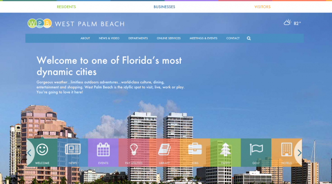
The City of West Palm Beach is getting a brand new website.
The process started two years ago when the Mayor assembled a task force to look at the existing website, determine what a new website needed. The task force was led by Chris Roog and included members of the local technology community including Jennifer Hampton, Lenny Gomez, Monte Lambert & I as well as members of the city’s technology team. We met with department heads and came up with a specification document which was presented to the city.
The spec is the easy part, and I’ve not been involved with the process since then. In the year following a development team was chosen to develop the site, stakeholder interviews were conducted to get additional information, and the massive job of creating the website began.
The work was done by the Ft. Lauderdale-based Starmark who did a terrific job. The City is still actively working on pushing content onto the site, but I was able to grab a couple of screenshots of the home page that I wanted to share. Please note that the website is still under construction and has not been officially released.
A quick overview of the new West Palm Beach home page
One of the items that was identified as an issue was the general finding of specific information on the old site. This issue is handled very elegantly in the new website. The most commonly searched for items were identified and placed in a colorful scrolling navigation. This navigation provides users summaries of the information they need without even leaving the home page.
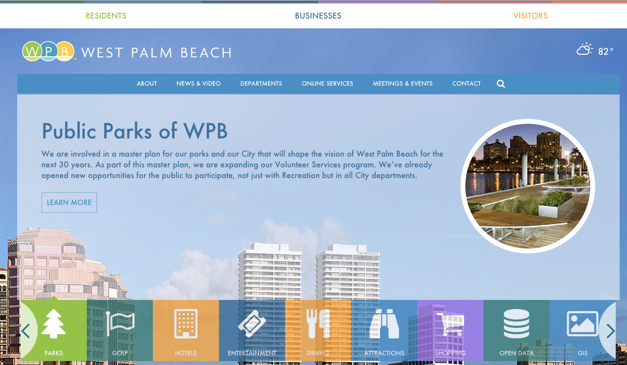
Here is an example of the “Public Parks” tab. It’s very elegantly overlaid onto the home page & with a single click you can jump into that section.
If that’s not what you’re looking for you can click on another icon to find more information. The main icons include: News, Events Library, Jobs, Parks, Golf, Hotels, Entertainment, Dining, Attractions, Shopping, Open Data, GIS, etc.
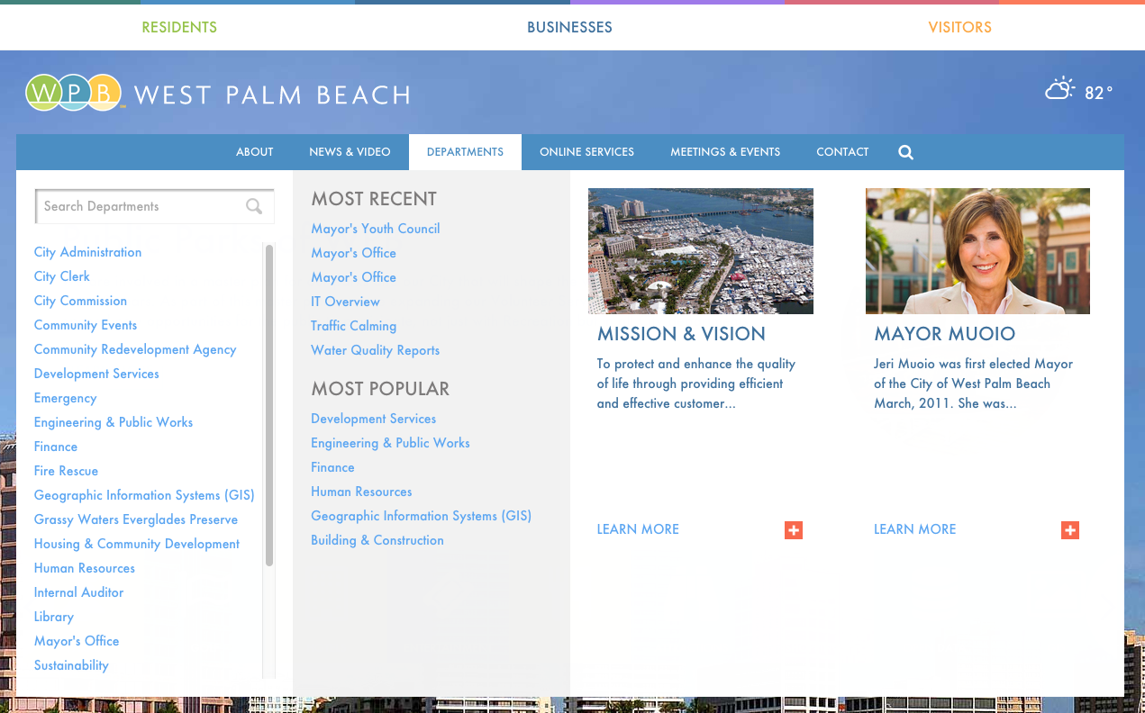
If you have a better idea of what you want you can use the more traditional navigation system, which has more links into the site. Each top level section has an area for what the city thinks are important links (on the far left), but then links to the most recent pages added, as well as the most popular pages.
Getting a navigation to work well is the most important, yet hardest parts, of a website. I think this solution is very elegant.
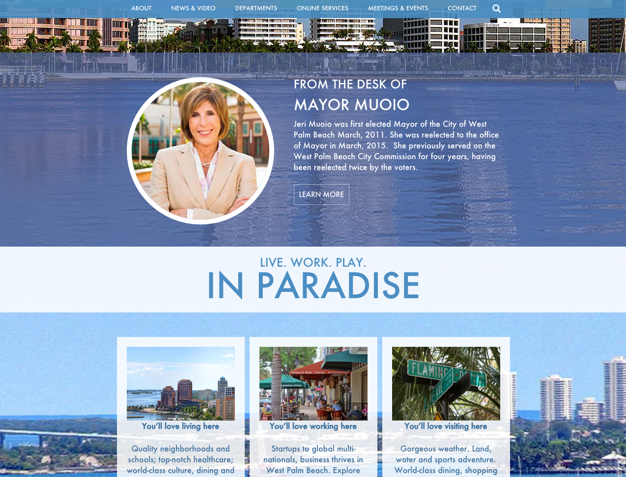
Scrolling down on the home page we come to a message from our Mayor with a little more information about the paradise in which we live, work & play.
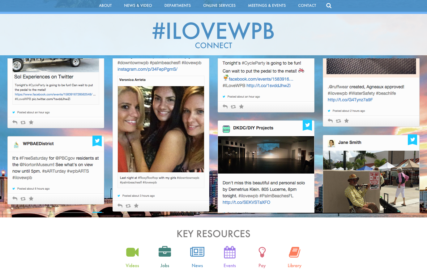
This is my favorite part, the great social integration and building the #ilovewpb hashtag directly into the website. This will be a dynamic feed from twitter & instagram which will include what the residents and visitors are saying about West Palm Beach in real time.
I’ve just gone over a few parts of the homepage, but I’m very happy with the work that has gone into this site and look forward to seeing it completed and go live.
